Symbolism in Fashion
I believe a person's appearance can say a lot about the kind of person they are. From the obvious sub-culture 'uniform' to religious garments, the growth of the fashion industry and consumerism has made creating a different identity for every day of the week possible.
I am interested in the various symbolism that can be found in a person's appearance, whether they are aware of it or not. This includes links to sub cultures, religion, historic events or socio/political movements. I think it is interesting that a lot of symbolism now goes unrecognised or perhaps exists almost ironically because of the growth in consumerism and globalisation.
Through reportage illustration, I want to explore how these symbols exist in fashion/appearances and write about what they represent and whether or not that meaning is still relevant to it's existence today.

07/12/2014
10/11/2014
Observational Drawing Research

During my research for a possible essay topic, this was an important part of my sketchbook. As I sat drawing people, I was either making comments about them in my head or writing it down in my sketchbook. I started to realise I was making assumptions of these people based on how they had chosen to present themselves that day. These weren't bad assumptions necessarily, but they were a kind of judgement of character - I was automatically categorising people based on their appearance. People have always done this and it is how people might identify sub cultures or a particular religion - our appearance creates a silent conversation between you and the rest of the world. Our appearance is a vital part of our identity - whether it is accurate or an assumed identity.
Art Gallery Task

The task was for us to visit the Art Gallery and draw things from observation. We had to pay attention to juxtaposition and the space itself rather than the exhibitions.
It was really interesting to see so many different visual responses to an environment when given the same task. It was a good exercise to remind me to be more inquisitive of my surroundings.
23/10/2014
Study Task 2
Society and Politics

Asaf Hanuka
This illustration depicts a man sat at an old type-writer. There are objects appearing from the wall opposite him, flying towards his open mouth. The way the man's mouth is open with his tongue hanging out suggests he is hungry. On his hat is the word 'press' and on the type-writer 'buy'. This suggests that he is some kind of writer, perhaps trying to make ends meet so that he can consume the next new thing. Are we all working just to spend, spend, spend?
As (Garland, K. 1964) says in First Things First, we have reached a "saturation point at which the high pitched scream of consumer selling is no more than sheer noise", we have become almost completely desensitised to the idea of consumerism. It has become so routine to purchase new goods on pay day because "the work of those who have flogged their skill and imagination" have convinced us to buy into particular lifestyles or have the latest gadgets.
However, the man in Hanuka's illustration is depicted as 'feeding' - this word suggests some sort of necessity as we must be fed to stay alive. (Beirut, M. 2007) suggests that all of the consumer selling, created by designers of different sorts might not be that bad, "What makes dog biscuit packaging an unworthy object of our attention...", "Don't dachshund owners deserve the same measure of beauty, wit, or intelligence in their lives?". Beirut also goes on to suggest that designers are just used for cosmetic purposes so that consumers are "hypnotized..." "with things like colours and typefaces". This would not work if humans didn't want to be surrounded by objects they admire in some way, which implies that consumerism was always inevitable - especially in the digital age when you don't have to leave your home to buy new things.
Returning to the earlier point that it is necessary to feed something to keep it alive, it could be indisputably argued that consumerism is necessary to keep our economy afloat. People often feel the need to give themselves a bit of 'retail therapy' to allow a little escapism from the lives they lead or perhaps just their boring office job. (Mau, B. 1998) says "Play can only happen when people feel they have control over their lives." so by buying into various products or lifestyles, people are taking control of their lives or at least making it appear so. "We can't be free agents if we're not free" - free to work to consume - whether or not we enjoy this idea, we are all guilty of it at some point.
22/10/2014
Study Task 1

- "Begin Anywhere: John Cage tells us that not knowing where to begin is a common form of paralysis. His advice begin anywhere"
- "Break it, stretch it, bend it, crush it, crack it, fold it."

- "Designers who devote their efforts primarily to advertising, marketing and brand developing are supporting, and implicitly endorsing, a mental environment so saturated with commercial messages that it is changing the very way citizen-consumers speak, think, feel, respond and interact"
- "Consumerism is running uncontested..."
07/05/2014
End of Module Evaluation
Throughout this module I have definitely developed my research and analytical skills and my knowledge of semiotics. Both Studio Brief 1 and 2 required an in-depth understanding of a subject so it was important for me to look at various sources and extract the relevant information. Whilst writing the essay for Studio Brief 1 I also became more confident with Harvard referencing and how to use in text citations - this perhaps isn't something that will drastically improve my practice as an illustrator, but it is good knowledge to have in an education environment.
In Studio Brief 2 I feel as if I stumbled into new territory because our illustrations required us to not only research and be informed on a topic, but to communicate that topic in any format we chose. Having such an open but heavily research led brief left me feeling very stranded in some instances because I had to figure out exactly what I was trying to say with the information I was gathering.
I am beginning to realise what my strengths are with my practice and what are the areas I need to improve on. My on-going goal is to be more exhaustive with my drawing and I think in Studio Brief 2, I really started to tackle this. As a result of this, I think it sped up my final image development process because I had already, intuitively created an appropriate aesthetic for the information I was trying to relay.
The weaknesses in my work have definitely been my lack of academic research sources. I tried to find as many relevant sources as possible, but I felt as if I needed more to really justify the points I was making. This may have been due to a small availability of sources relevant to the topic I had chosen however.
If I were to do this module again, I would spend more time doing more in-depth research and being exhaustive of the different academic sources. I feel as though I only prioritized this module when it was close to deadlines, so at some stages I don't think I really met my full potential. I found that when I was looking at my research, I got a clearer idea of what I wanted to do or what I could develop further. If I spent more time researching/informing myself, then my understanding and the development of my work could have gone further. However, the time spent researching was also influenced by other responsibilities so it couldn't always be prioritized.
THEORY INTO PRACTICE - A Visual Response
Evaluation


Throughout a lot of this project I have felt directionless and very unsure about what I wanted to communicate. I started my visual research with a lot of momentum and then as I neglected my research and informing myself on my chosen topic, I lost that momentum for a while. However, once I started looking into the different cultural codes of Metal culture, I got a better idea of what to produce and what I wanted to communicate.
I found it quite easy to find a visual aesthetic that suited the tone of voice I wanted to create just by experimenting in my sketchbook and then doing the same digitally with textured brushes and loose line work. When it came to actually producing a physical copy of my zine, I struggled with getting the colours to print correctly, so it took quite a lot of trial and error. However, that has definitely been beneficial because now I understand how different papers and printers affect the outcome.
General feedback from peers has been positive so far, although none of it was from a formal feedback session. I aimed to give my illustrations a bit of humor, which isn't a strength of mine, and combine it with an informative tone of voice. I think I've been successful in doing so but I also want to let my audience (peers during the crit/feedback session), help determine that.
THEORY INTO PRACTICE - A Visual Response
Unexpected problems


When I printed this version of my zine, I was really disappointed with how the colours had come out. They were much too dark and the textures didn't print at all. Compared with the draft version I did previously, on cheaper paper using a different printer, this 'final' print out looked awful.

How the colours and textures were supposed to look:
It occurred to me that although I used the correct colour settings in Photoshop, that it was possibly the paper and the type of printer that was affecting the colours. The mock version was printed with a laser printer, whilst the other version was an inkjet - I hadn't realised this could affect my artwork before. The paper I used to print on the 'final' version also scratched very easily which made it, in my eyes, unpresentable as final outcome.
I resolved to alter all of the artwork to make it much lighter so that when printed, the textures and colours would be more like on screen. I also chose a different kind of paper that didn't scratch and as a last minute decision, I made a sleeve to keep it closed and presented nicely.

I do think that the cover is a little bit too light but I am satisfied with how it looks overall.

06/05/2014
THEORY INTO PRACTICE - A Visual Response


- Text needs moving within some kind of margin as it was cropped & looks too close to the edges on the digital ISSUU version.
- Colours have printed mostly okay - some areas need to be lighter
- Will possibly edit front cover because it feels a bit bare at the moment - need to add name as well.
THEORY INTO PRACTICE - A Visual Response
Finished illustrations


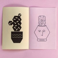
- I found using a monochrome/limited colour palette really useful because it helped me stick to the codes/palettes I pointed out in my essay.
- I wanted this to be informative but also humorous - I think this translates into my work - using thick textured brushes helped to define the tone of voice - reminds me of short comics found in newspapers.
- Producing a mock up previously really helped me to figure out where the textual information would sit in relation to the illustrations - being exhaustive with drawing is important.
- Some areas of the illustrations look a little dark on screen - I will review & alter accordingly once my test print is done.
THEORY INTO PRACTICE - A Visual Response
Page development:

Page 1, handwritten.

Page 1, using a font I found which was similar to what I wanted my handwriting to look like on the previous example.
I am choosing to use the digital type/font for each page of writing because overall it will look much more professional. As I was writing with ink I found I made quite a lot of mistakes that weren't always easy to rectify. By using digital type I'll be able to adjust the writing much more easily.
I also think that the handwritten text doesn't stand out enough. When it is put next to the illustration, it definitely gets washed out because it doesn't have enough contrast.
02/05/2014
THEORY INTO PRACTICE - A Visual Response
Developing illustrations
Initial mock up of page 1 & 2

I wrote the text out by hand using an old mechanical pencil dipped in ink. I knew that when I scanned it in the edges of the letters would look similar to the textured brushes I would be using to draw the illustrations.

Whilst creating each page I looked at what I had noted about metal album work in my essay. For example, dark colours & grungy textures, so I made sure to implicate them into my work.

I'm not sure if I like the text - it doesn't really stand out. If I can find a suitable font then I'll scrap my own hand-writing - this would probably look cleaner and more professional anyway.
30/04/2014
THEORY INTO PRACTICE - A Visual Response
Another zine mock up:


- Text is all based on the information I found in previous post
- Illustrations and compositions need refining - what kind of aesthetic? - Possibly similar to previous mock up
- Will be produced digitally
- No longer hotdog booklet - needed more pages
- Will be an A5 booklet when finished
THEORY INTO PRACTISE - A Visual Response
Research into metal culture:


This research will help with the content for my zine/book. I basically researched the truths/origins of the social codes within metal culture and I'm much more confident in what my zine will actually be about now. It will be more factual/informative than my previous mock-up so I'm currently aiming to create a 'guide' to metal culture.
23/04/2014
THEORY INTO PRACTISE - A Visual Response
Further Zine development:

Although I like the aesthetic of this rough zine design, I think the content is driven by my own opinions too much. I need to include more facts and information about the subject so that it doesn't stray too far from my original starting point which was the essay.
As I begin to inform myself more on the subject matter, I think the purpose of this zine will change slightly. Originally I had planned for it to be a satirical depiction of the way 'Metal heads' resist conforming to mainstream cultural codes but end up conforming to another particular cultural code. This hasn't really changed but I think that instead I'll be focusing more on what the cultural codes within metal culture are and some background of the culture. Perhaps this zine will become more informative rather than satirical? - The tone of the illustrations can either make it seem quite heavy and factual or interesting with a bit of humor. I am hoping to create the latter and I think that by drawing in a similar style to picture above, I can achieve this.
Things to consider:
- CONTENT - research metal culture - what are the different 'codes'?
- Research history of metal culture and how it has evolved
- FORMAT - will the zine need more pages than a hotdog booklet?
08/04/2014
THEORY INTO PRACTISE - A Visual Response
Pecha Kucha feedback & evaluation
http://issuu.com/sophiehargreaves/docs/pecha_kucha_presentation


- it being quite early on in the development of the project (judging by other people's presentation and their lack of development work too)
- I was incredibly nervous which could have affected my delivery (I get extremely anxious about presentations and I was the last to present)
- I had some technical issues - in the future I will just use the college macs to make sure my files don't get corrupted somehow


I found the feedback really helpful because it not only verified to me that I had a fairly good project planned, but it also brought some other potential ideas and issues I could come across. Talking about my ideas also helped to clarify what I was actually exploring - I'm really looking at how metal is a genre/sub culture that rejects association with the mainstream and is all about non-conformity. However, I think that although this subculture doesn't conform to the 'mainstream', it still conforms to the codes within that subculture.
Currently, I am calling my zine 'How to spot a Metalhead' and I will be illustrating all the different cultural /social codes associated with metal subculture. As suggested in my peer feedback, I could create more zines for other subcultures.
The development of my illustrations will be really important because I don't want to mock these subcultures, it is just supposed to be humorous but not offensive.
THEORY INTO PRACTISE - A Visual Response

I've chosen to make a hotdog fold zine because I think it's the most appropriate for the tone of voice I want to create.
I will have six pages and front & back covers to illustrate. I want this zine to be short and easy to read - any longer and I think the content could get boring.


This is my first rough to see what kind of compositions I could work with and how the page order could look.
I need to swap a few pages round, possibly even change the content of some. I am not sure about what sort of aesthetic I want to create yet but I'm going to try something similar to Kristyna Baczynski's work and this piece I produced for Visual Language.
22/03/2014
THEORY INTO PRACTICE - A Visual Response
Researching Zines

What format would be most suitable?


What kind of colour palette should I set myself? Monochrome, two colour plus stock?


I like the idea of printing onto coloured stock and then just using one colour for the illustrations. Would this be suitable for my topic though?


I am unsure whether or not to screen print. It would be a good way to produce lots at the same time and would encourage me to think about the colour more.


After looking at all these differen't examples, I realise now that I've got to consider all sorts of things like colour palette; number of pages; what stock it will be printed on; the colour of the stock and printing methods. I've also noticed that not all of these zines have full page illustrations - is this something I could consider or does the page look a bit too empty? I am still edging towards using a hotdog fold for the booklet/zine - since there will only be 6 pages plus the covers, I could do more than one.
Subscribe to:
Comments (Atom)