At this point I was still really stuck in what direction my project was going in. I still didn't know what I was trying to say.
I thought about using elements of metal bands lives/background as visual material to create a pattern with, as pattern designing is something I'm quite interested in. However, this quite quickly lost appeal to me and I thought that it would end up being pretty repetitive. I knew that if I was going to create work I was proud of (one of my goals this semester), I'd have to be really interested and invested in an idea.
Out of nowhere, I had a bit of an epiphany. I hadn't thought much about this module because I felt I had so much other work to think about but as I gradually got my teeth into everything, I had more space to think about this. Previously I hadn't realised how my workload and stress levels affected the quality of my ideas and work.
The idea is to use all the information I have gathered about the metal genre and metal heads and create some kind of zine. I re-did my mind maps so they were much more clear and to organize my ideas:
I'm surprised it took me so long to come up with this idea. Upon reflection, it seems like the logical thing to do after writing a semiotic analysis of metal album covers. I've already got most of the information I need so I'm going to translate it into a little illustrated zine.
My initial thoughts on creating a zine:
- It needs to be short & humorous
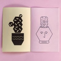
- Contemplating using illustrator to for the line-work (similar to my Visual Language piece)
- I need to look at other illustrators work similar to this idea - what kind of layout should I use? Should I use a limited colour palette? What kind of drawing style is appropriate?
- How will I physically make it? I am currently thinking a hotdog book will be suitable
Although I haven't made much of a visual progression so far, I think in terms of ideas I've finally got something solid to work with and have more confidence about the upcoming pecha kucha presentation.